|
|
|
UX Scrub
|
December 2015 - January 2016
|
|
|
|
|
UX Scrub
|
December 2015 - January 2016
|
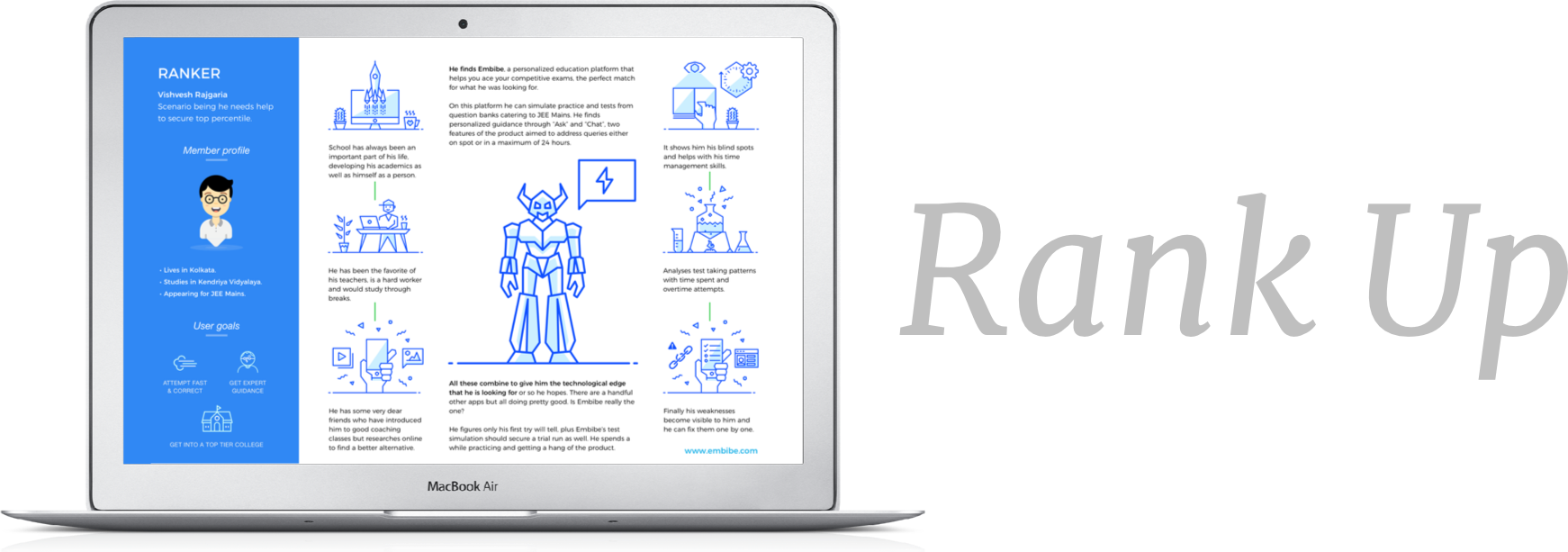
ResearchThis is one of the most unusual research exercises. We have 20 users, few of them who have used Embibe before, all cooped up with us for about 20 to 25 days. The plan is to have a hybrid research process using both natural use and scripted use modules to gather all-round intelligence. The data we are looking for is both qualitative and quantitative and will be gathered from interviews, surveys, competitive analysis, data analysis, card sorting exercise and usability testing . We have 3 to 4 weeks to do this.
While it's good to have about 25 to 30 in-house testers for the major part of the project but at the same time it seems necessary that we do not overlook the bias that forms as these users spend more time with us. |
|
Apart from many other things, we note that,
Competitive analysisNothing that already exists solves these frustrations as pointed out by the research and users. So we set out to examine all the existing products to see what they do and how they do it. I will not be able to publish this information, but our end goal of understanding exact user needs and cues to product awareness and education is achieved.
Creation and key guidelinesWith 5 days of the project gone we have a little more time before the users become heavily biased towards Embibe. It's important to note that we need only 6 to 8 unique participants for the initial interviews so we still have some fresh eyes for qualitative feedback for testing.
|
|
The job of information architecture is to
make decisions and break norms when it comes to user experience. |
|
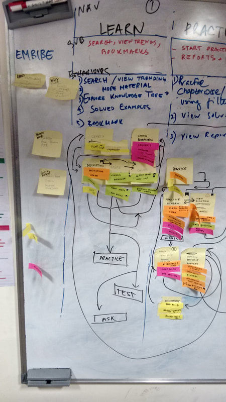
To get to our information architecture we pick up the entire current sitemap and decide to take it apart into groups of interdependent components to address any logical errors in the current sitemap.
|
|
Using open card sorting and focus groups we come to a clear understanding as to what the hierarchy and navigation of the website should be. We segregate our users into groups of 5. Each group spends 25 minutes with the design team to come up with the best navigation possibility. Being the key stakeholder of this exercise I ask participants to organise topics into categories that make sense to them with the help of the labels given to them.
By now we have enough information about the users to have a holistic perspective of the overall exercise and rule out any biases. We also took care to update labels according to heavyweight suggestions from the users. Decision makingA research model is strictly defined and followed to make sure we gather the right data in the most efficient methods possible.
Consequentially every design decision we take is clarified by high position stakeholders such as the Design Head and the Founder/CEO. Apart from this we are in coordination with the Product manager to make the delivery of the product to the Tech team and follow it up with an Agile build with every part of the project. Testing existing systemWith 3 weeks of the program almost gone by the last task we have left is to be divided among the last 2 groups (10 users) of unbiased users for a User test round. We carry out close usability testing with the aid of videos and questionnaires. We assign each user a URL to test and ask them 20 - 25 questions, like "How intuitive is it to use the interface", "Arrange the sections on the URL as you see fit" and "How visible are objects, actions and options".
From this exercise we then receive a huge number of suggestions and fixes that we denote to be anywhere from high impact - low effort, to high impact - high effort. We organise the bugs and fixes first before proceeding to moonshot changes Way forward
|
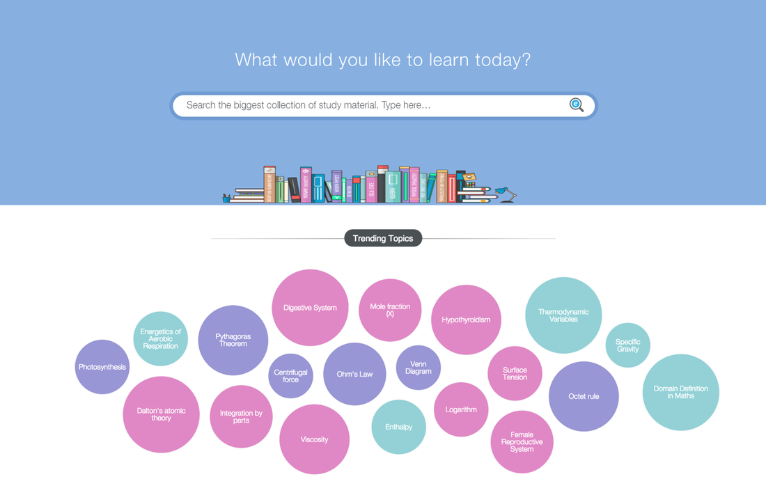
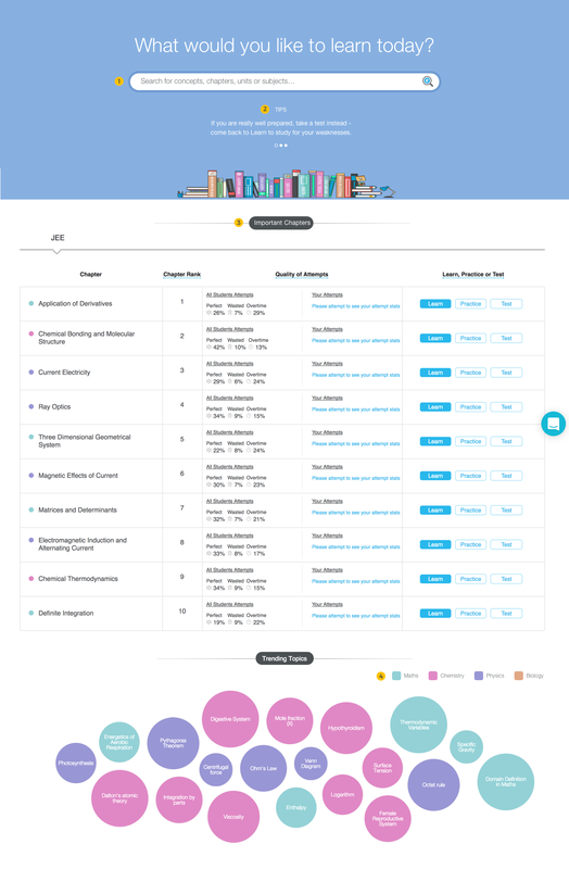
LearnFor this property most of our concern is to make sure the product is understood by the user and easily accessible, it is imperative to remember Learn is the 1st landing page for the product itself.
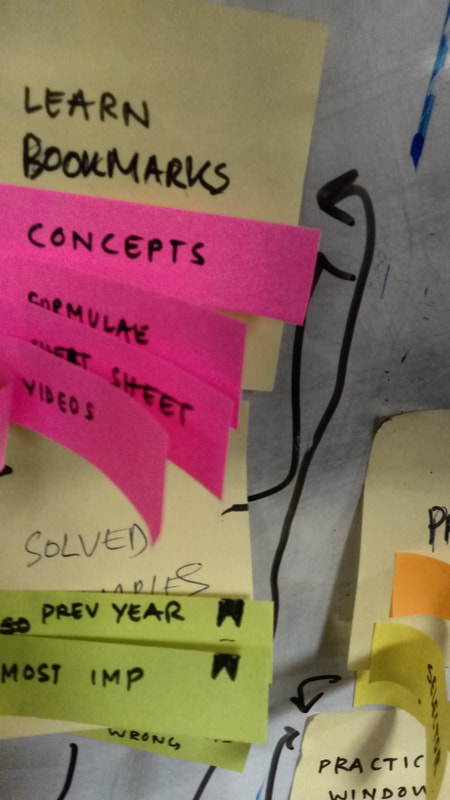
We add necessary search functionalities, product tips, tooltips and quick access points. We improve one of the key features of this property, which is the Knowledge Tree, a map of every concept, chapter, unit or subject that is connected. This will also be the secondary method of navigation within the Learn property along with Search. |
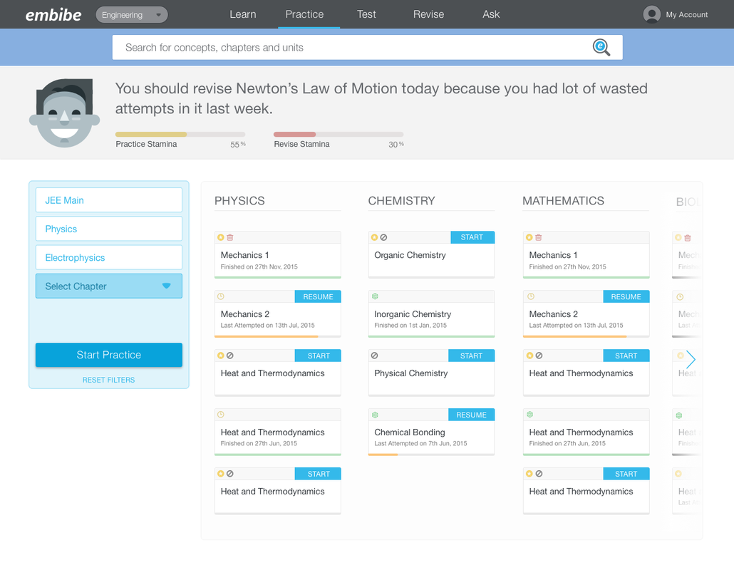
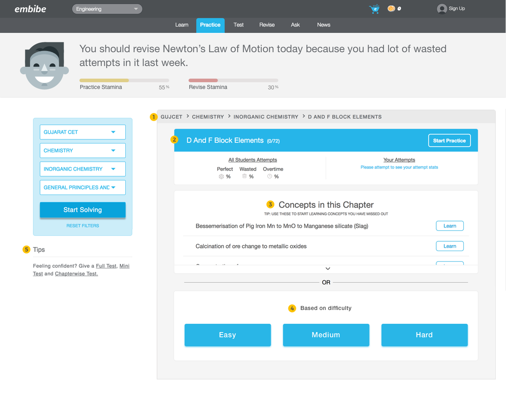
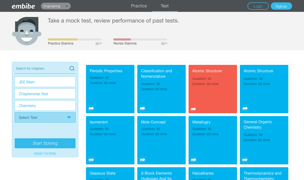
PracticeThe core most visited aspect of the product which enhances student's possibility to get your aimed percentile is the Practice property. Hence the improvements we make to this are in line with the same goal, help achieve the user's objective percentile.
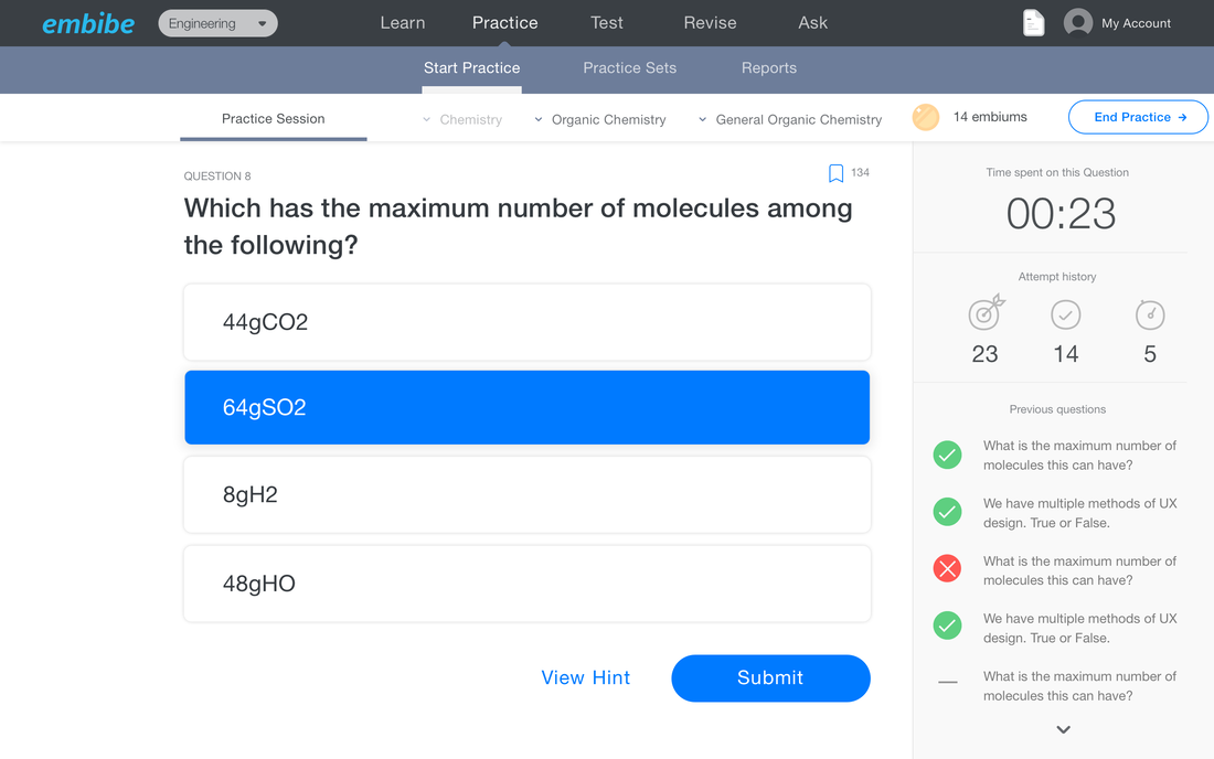
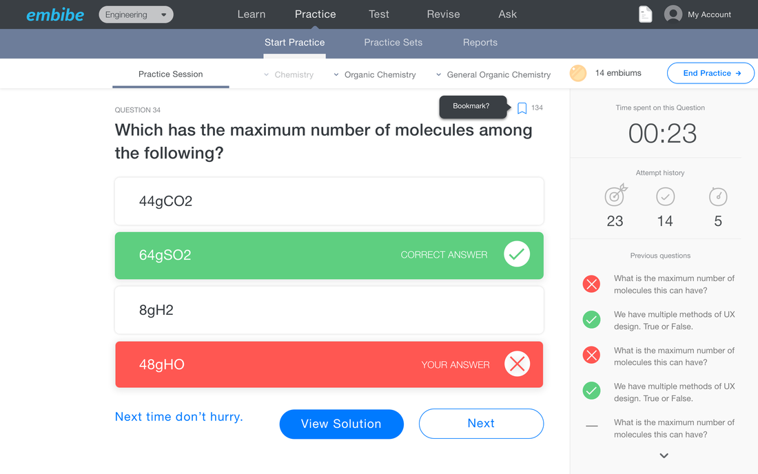
We therefore introduce Easy, Medium and Hard options depending on the difficulty of the question and the one at which the student is comfortable. We introduce navigational elements to help students peer into each practice set as well and to see their past attempts. Tips are to help you get started with Embibe in the right way, everyday. We start by designing a new take on the practice window - bolder, cleaner, easier. Stakeholders love this design yet aesthetics are the last part of any product's design - we have to make space for really long questions with funny numbers in them too. So we come to a middle ground leaving enough space and accessibility options on the practice window while helping the user learn, practice and secure better attempts. |
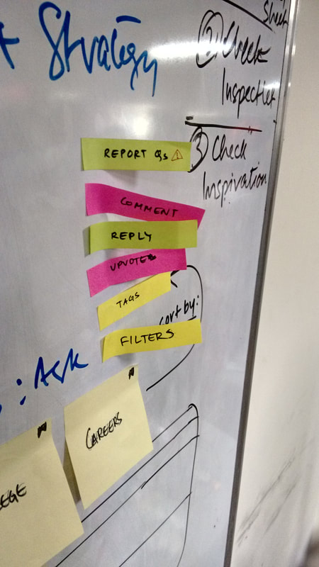
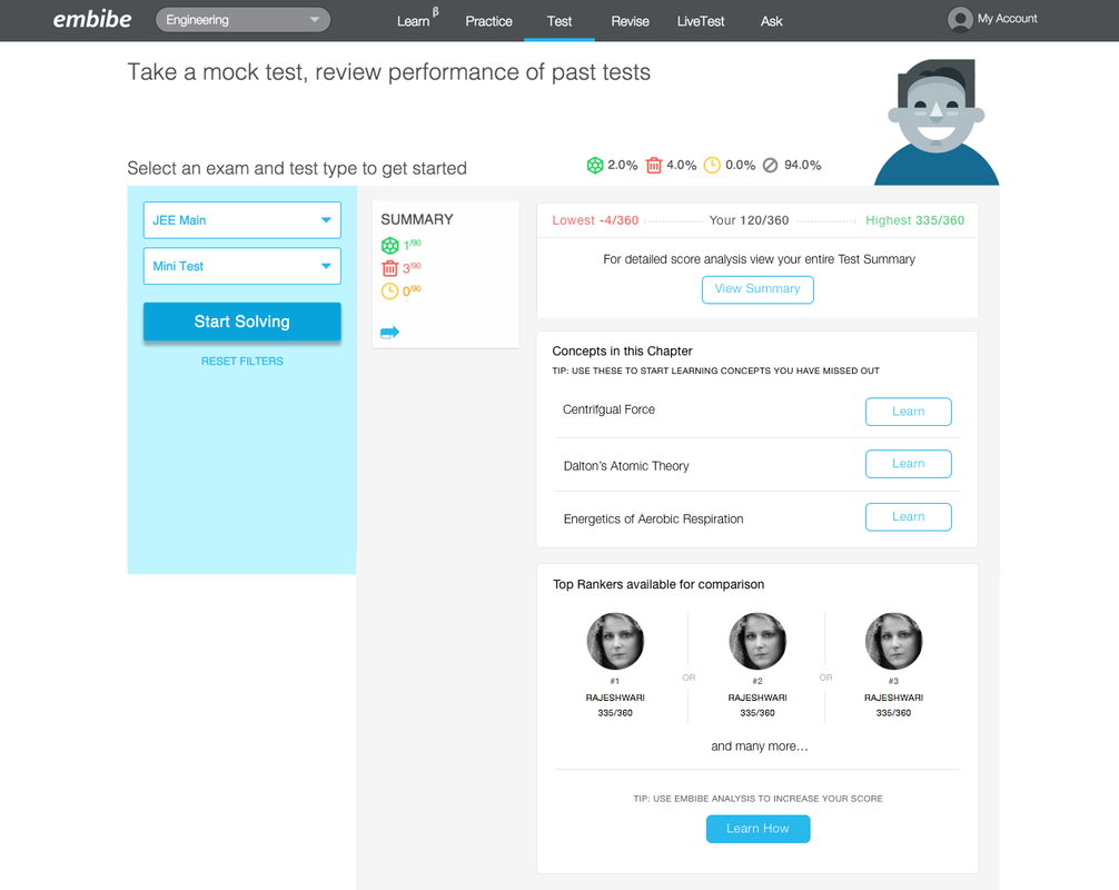
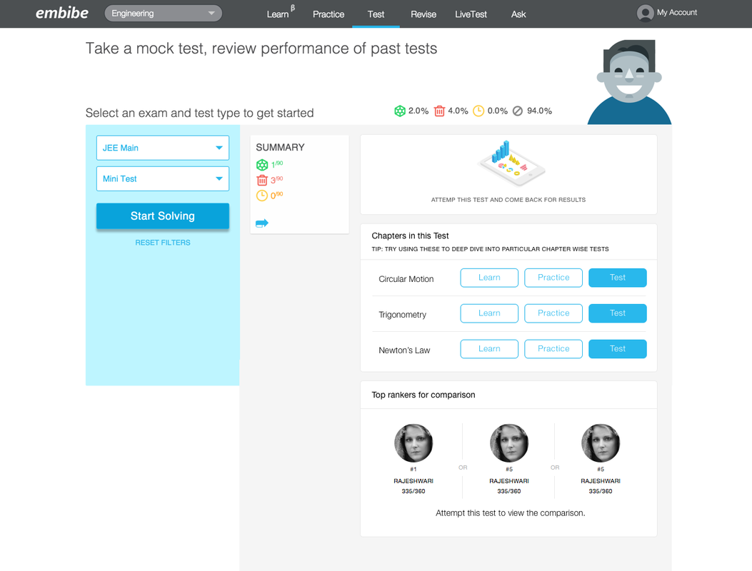
TestA similar update as we made for Practice is made for Test. We update the view of each test attempt (average, highest and lowest marks) to give users an overall view of their latest scores. Test summary still stays the same but is easy to access since it comes up on the screen when you first click any test.
We also add a Top rankers for comparison list where they can compare with top rankers for the selected test from the past year. This helped the users to have a reference point and spoke a lot about the product as well as the content we offered to our previous users that helped them achieve their goal. |
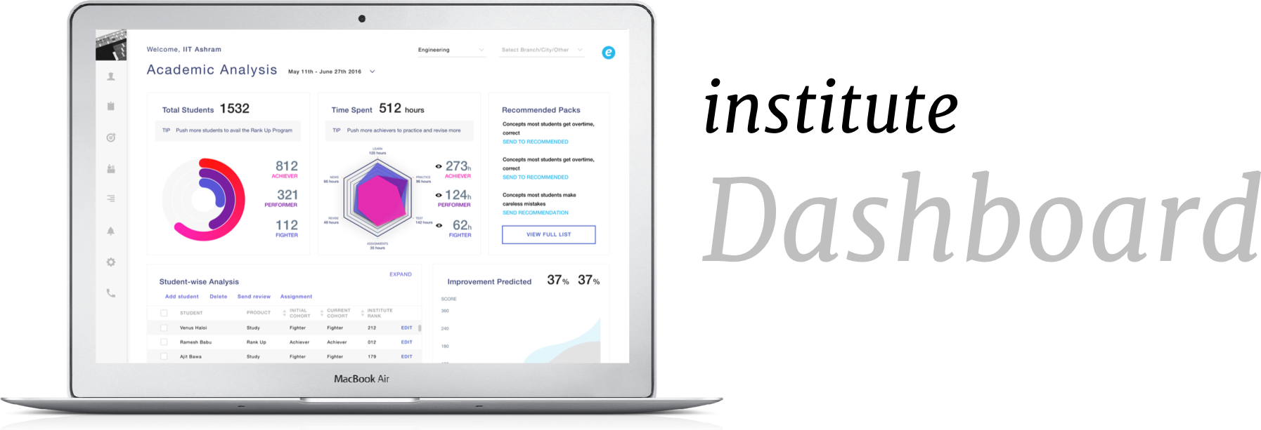
Building metricsThe primary goal of the project is to redefine a way to collect, analyse and treat data for all decisions related to product. Product, data and design teams are to work on this and provide a model for the user cohorts and analysis.
Our Head of Data Science comes up with the cohort model and each team accordingly sets principles and practice in place to collect, analyse and treat data as was the goal. ConclusionThe purpose of the case study is to put the design project into context and to show how it works in a real world situation, as opposed to showing only how the final product looks.
The user cohorts we come up with help us achieve the following among other things through the lifetime of the product,
|